
Summer Card Camp began today! Our week 1 color combo is definitely out of my comfort zone! Check it out:

I think the purple threw me off the most. I'm not a huge purple fan. But luckily, I did get the new Damask Designs patterned paper in the latest PTI release, and it includes a Royal Velvet pattern (I think I just might even buy a package of the cardstock in my next order.... gasp... did I just say that?). :) So I pulled out a sheet of that, long with some Hibiscus Burst, Orange Zest, Spring Rain and White. Here's what I ended up with:
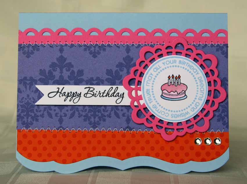
I used Polka Dot Basics 2 to add the fun dot pattern to the orange. The sentiment is from Gracious Vases, the circle tag is from Birthday Tags and the cake is from Tiny Treats: Birthday. Dies used are Doily Details, banner, and Edgers #1. The banner and tag are popped up on dimensional adhesive. I added some stitching (I'm trying to do that more often!) and gems to finish things off.

I can't wait to see whats in store for tomorrow! I've already pulled some papers to try this color combo again. Thanks for looking!
13 comments:
I love it! I struggled with the pink and orange but was pleased with how it turned out. This is gorgeous! I so love your stitching. That is something I do NOT do well.
Love the dies and background that you used!
heehee...you posted right before me. :)
Love your card, Debbie. I like how rich in color it is..very pretty..and I keep forgetting to get those Edgers! That looks awesome.
Great job, Debbie! I really struggled with this color combo, too, but I guess that's what it's all about, right? Your card turned out great! The Damask PP was the perfect addition. (By the way, Royal Velvet is FAB!)
-Amy
Recognized your name from the Forum so thought I'd check out your creation. I really like it but can understand the difficulty of the color challenge. It was a bit out of my comfort zone too, but that's why I'm thrilled to have won a spot in this class.
bdlakebum (on the Forum)
pretty! enjoy the class!
Wow, I would have never thought to use that color combo, I love how your card turned out.
Debbie this is FANTASTIC! LOVE it! Such a GREAT color combo!!!
I think it looks fabby!
Seems like everyone is challenged with this color combo! :)
But you did great with it...
fabby card!
Ooooh, lovely!!! I love how you managed to tie it all together - one color isn't just "stuck on there" for the sake of completing the given scheme.
And, I also **love** your MIM card. The blue ink on white, with the balloons? Brilliant!
Debbie.......I think you did awesome for not having purple as your favorite color. I think the hardest color for me to tie in was the blue......I love blue, but I just struggled making it work with the others. I think this class is definitely going to push us.....in a good way! Great job, again!
Debbie, This is beautiful. I love all the details!
I think you did a great job with this card, love all details and that damask paper, I may have to add that to my wishlist... :)
Holy Hannah! What a card! Love the colors and how fabulous and fierce they are combined in your capable hands. Love the layering of the Edgers especially. Fab job!
Post a Comment